Visual concept and identity for the Swedish EU Presidency 2023
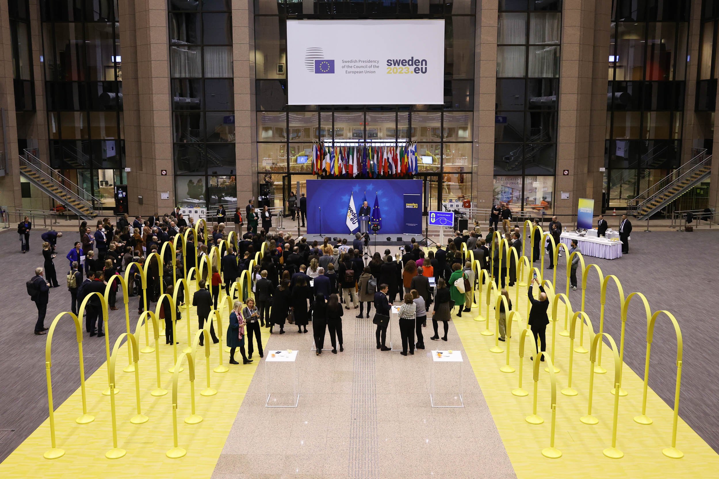
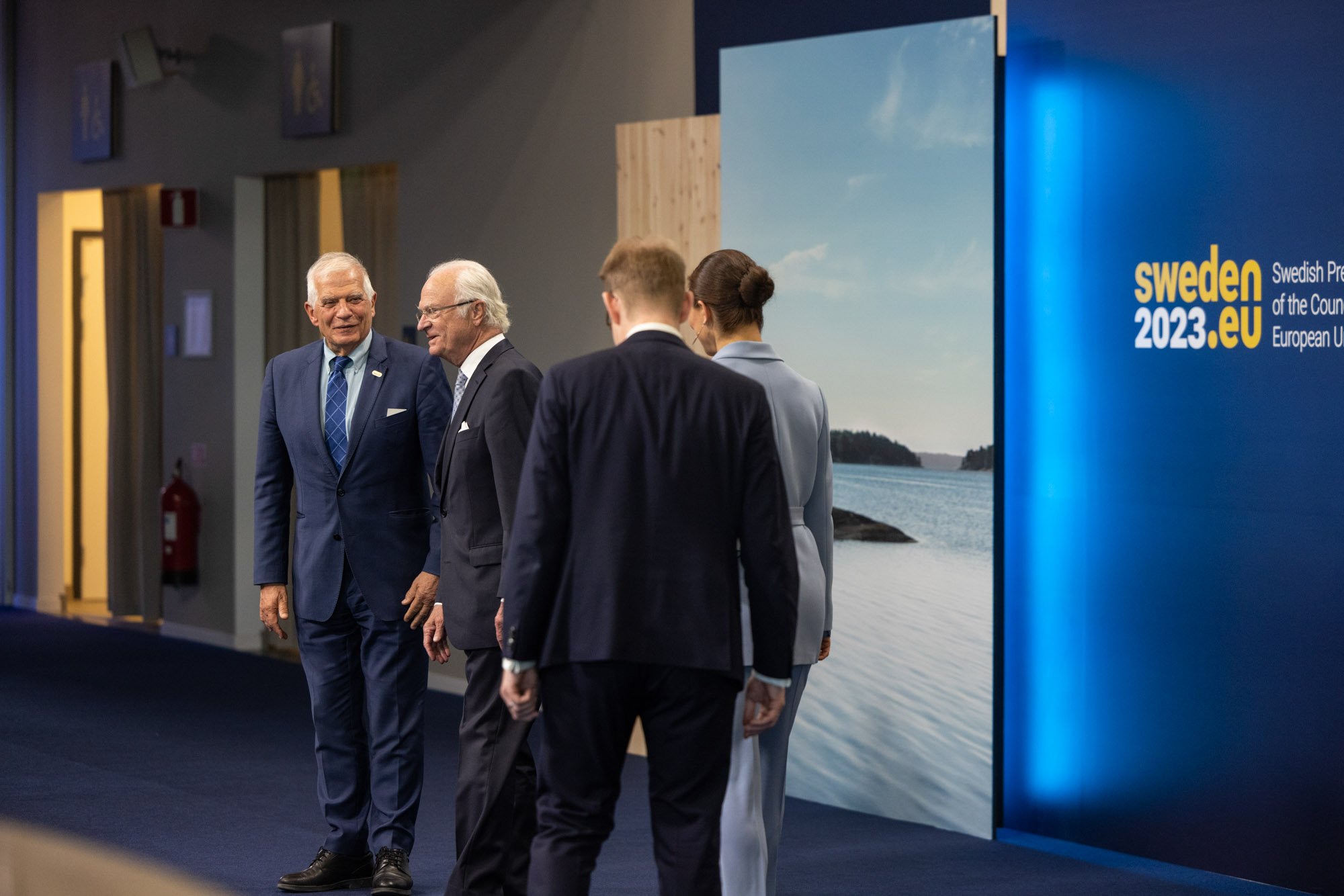
In the first half of 2023, Sweden held the Presidency of the Council of the European Union. For six months, Sweden led the work in the Council with the aim of making the EU more secure, freer and greener.
Our team at Intellecta worked with the Government Offices of Sweden to develop the visual concept and identity for the Swedish EU Presidency. Additionally, I was responsible for designing and crafting a 3D motion presentation of the logo. The movie was broadcasted in connection to summits, meetings and online.
Role
Art direction, concept development, 2D & 3D Motion
Client
Swedish Government Offices, 2023
Team
Head of Visual Identity: Charlotte Woon, Government Offices of Sweden
Client Director: Tomasine De Geer Tegnér, Intellecta
Creative Director: Anders Bergkvist, Intellecta
Art Director & Motion Designer: Angelica Zander, Intellecta
Graphic designer: Amanda Bolldén, Intellecta
Image credits
Government Offices of Sweden, European Union
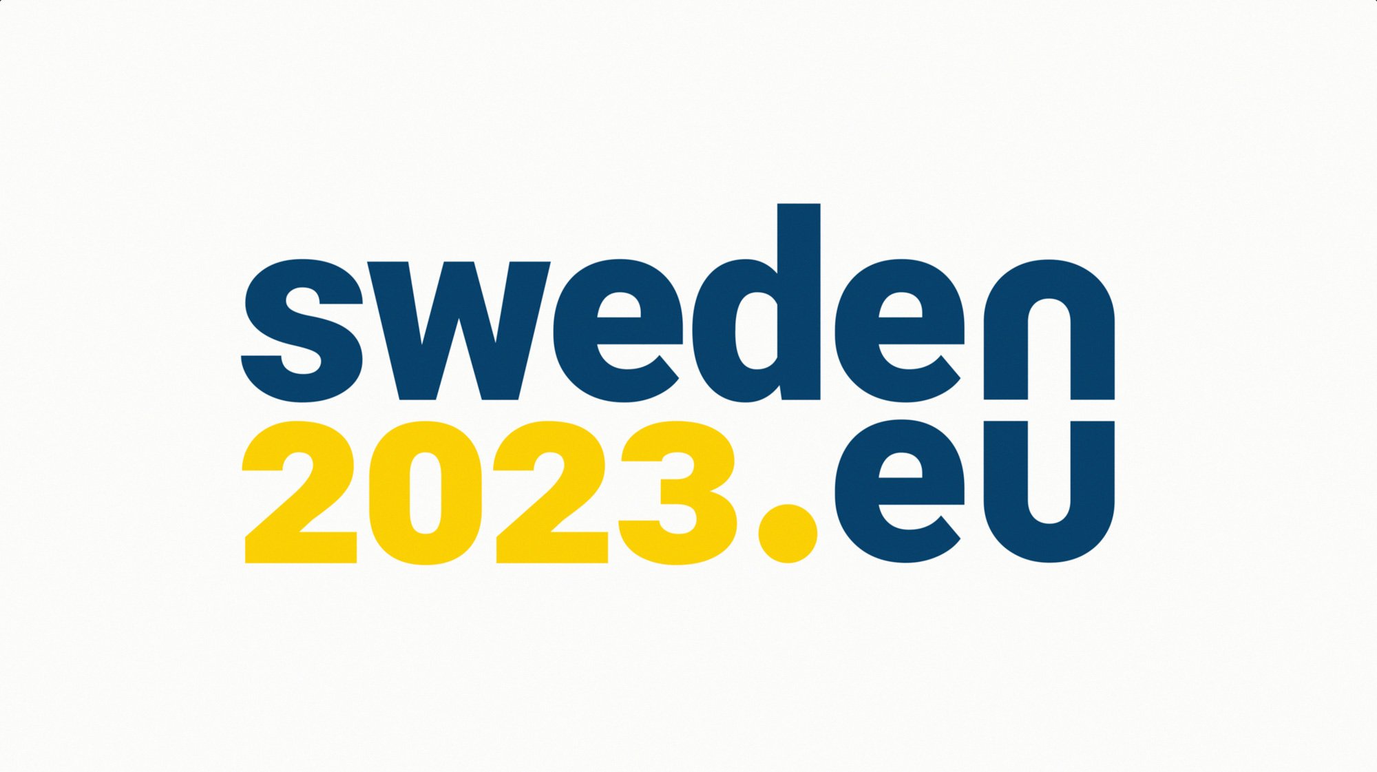
The logo and visual identity
The presidency logo represents solidarity and community. ‘Sweden,’ ‘2023,’ and ‘EU’ form the presidency’s web address. By highlighting different parts of the logo based on the word ‘we,’ additional messages are emphasized:
‘Sweden EU’ underscores Sweden's role as the presidency holder and its contribution to the Union.
‘We 2023’ reflects that Sweden, as the presidency holder, acts in the common interest of the Union.
‘We EU’ illustrates the sense of community among the EU Member States and underscores the Union's importance for its citizens.
‘We’ is also utilized as a central concept in the overall communication strategy, where this word is emphasized to convey messages.
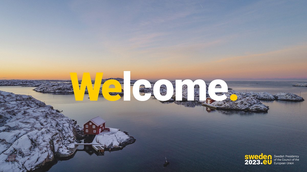
The color palette and belonging gradient is inspired by the Swedish light and its variation from January to June, representing the presidency term.

The 3D motion presentation of the logo
Styleframes & storyboard

The dot in the logo symbolizes determination. It begins to rise from the darkness, spreading light.
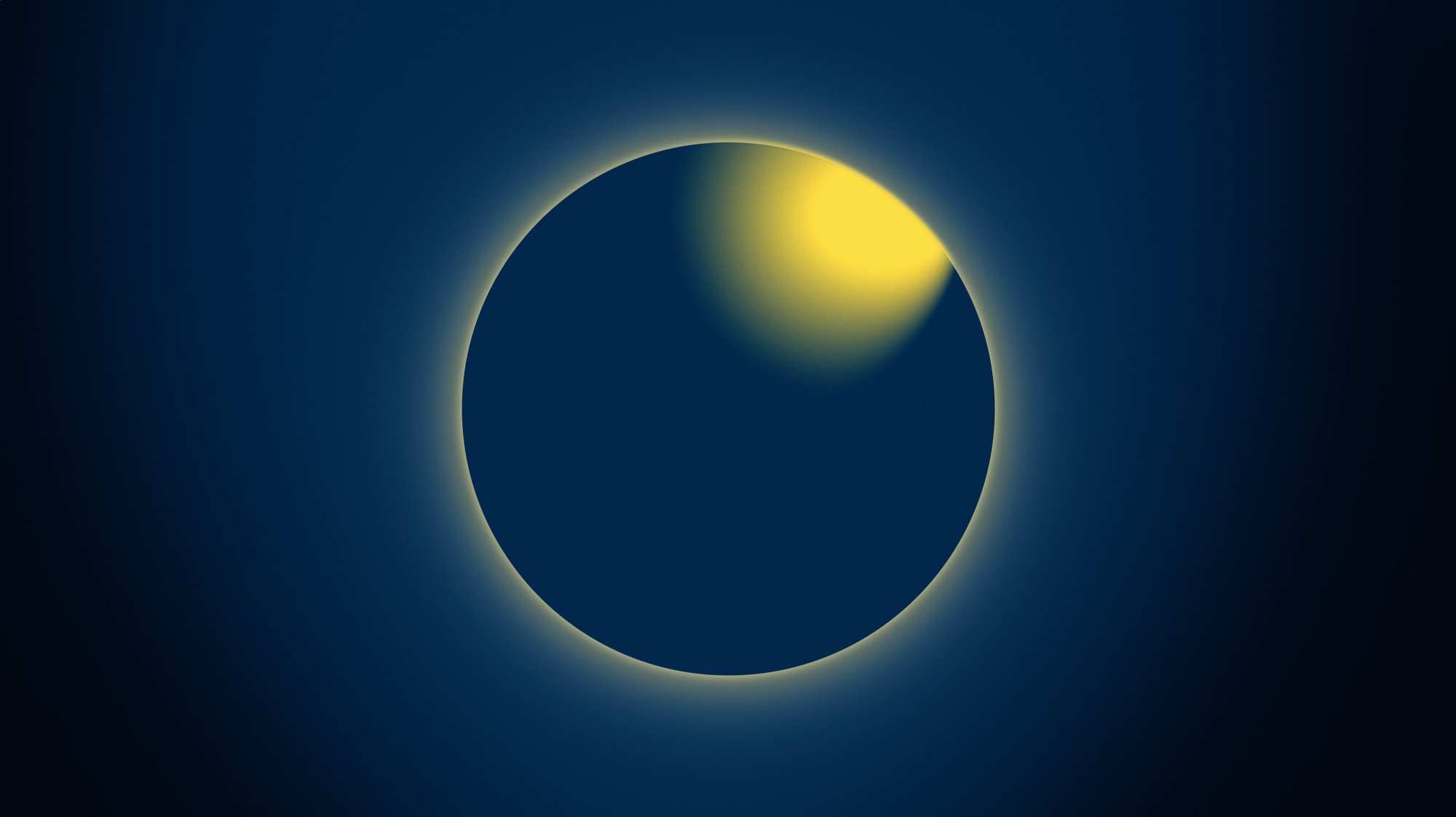
The dot is seen from above and visually resembles the Earth. The light emanates from Sweden.

A close-up of the ‘w’ in the logo, also rising and radiating light.

The word ‘we’ emerges from ‘Sweden’, emphasizing that Sweden, as the presidency holder, acts in the common interest of the Union.

The ‘n’ and the ‘u’ move towards each other to form a chainlink, symbolizing the unity of the EU member states.

The word ‘EU’ becomes visible as the yellow light takes over, spreading hope.

The full 3D logo bathes in sunlight and transforms into…
… the official version of the logo.
A peek into the motion design process & style exploration


The applied concept in action